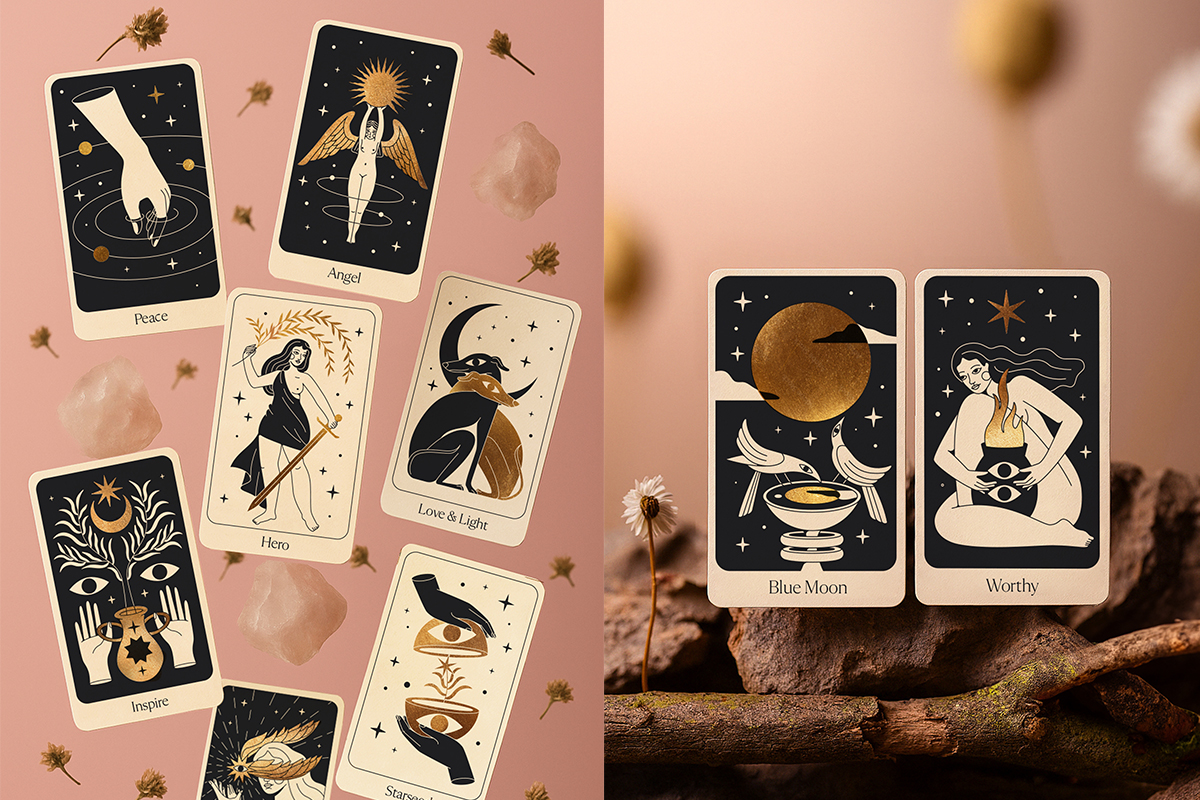
11:11 Oracle Deck
︎ Illustration & Art Direction
A visual and emotional journey I loved being part of.
I illustrated and designed this 52-card deck for Eleven Love, a jewelry brand rooted in spirituality, intention, and everyday magic.
Each card explores themes like healing, friendship, inspiration, and hope, and was crafted with care to reflect the brand’s voice in a soft, meaningful, and visually cohesive way.


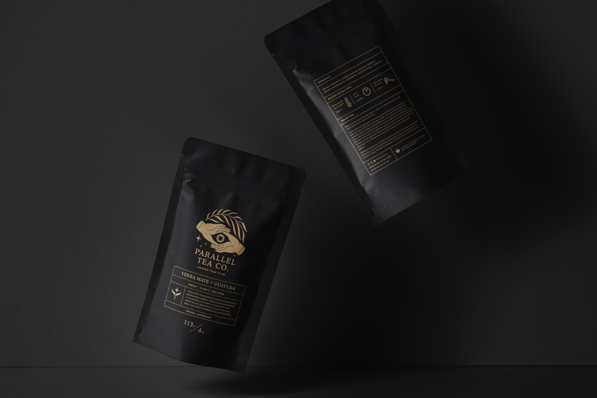
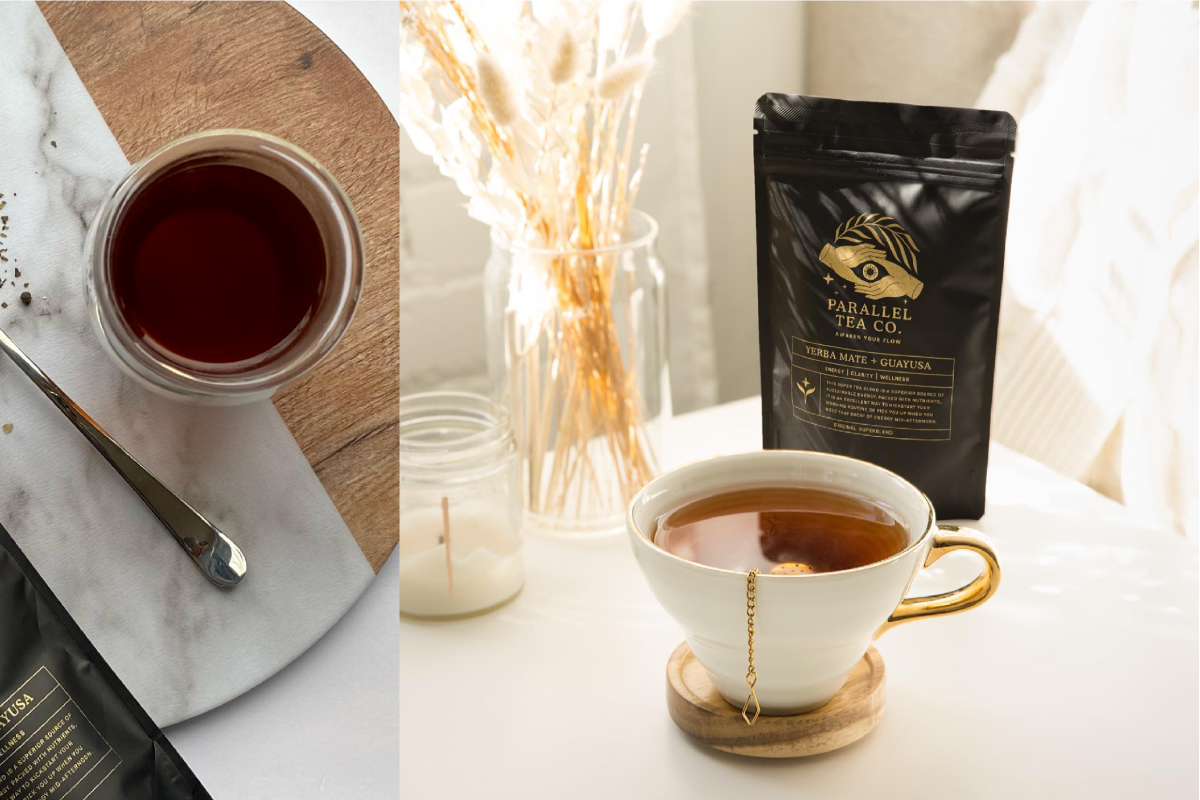
Parallel Tea Co.
︎ Identity & Packaging
Parallel Tea is a Canadian-based SuperTea company dedicated to sustainability and individuals' profound spiritual well-being.
I enjoyed creating their logo, branding, and packaging encapsulating Parallel Tea's essence. While developing the branding, my primary aim was to integrate the concept of natural herbs from the Amazon, spirituality, and human connection, symbolized through the imagery of hands. A space between the fingers forms an eye, symbolizing awakening, which perfectly resonates with the brand's slogan: "Awaken Your Flow."


Taiga Society Candles
︎ Identity & Packaging
Taiga Society is a captivating brand made in Russia, igniting a delightful array of exquisite candles, diffusers, and auto perfumes. The brand's name is a nod to its origin, birthed in a small town near the Siberian taiga. And the word «society» wanted to give the feeling that you are entering a unique society by buying a product.
This project aimed to seamlessly meld minimalism, elegance, sophistication, and sustainable materials into a cohesive concept with a call to the forest and nature.


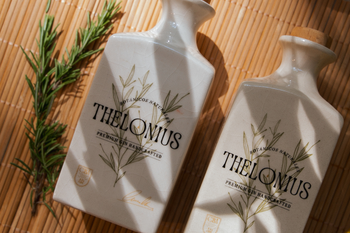
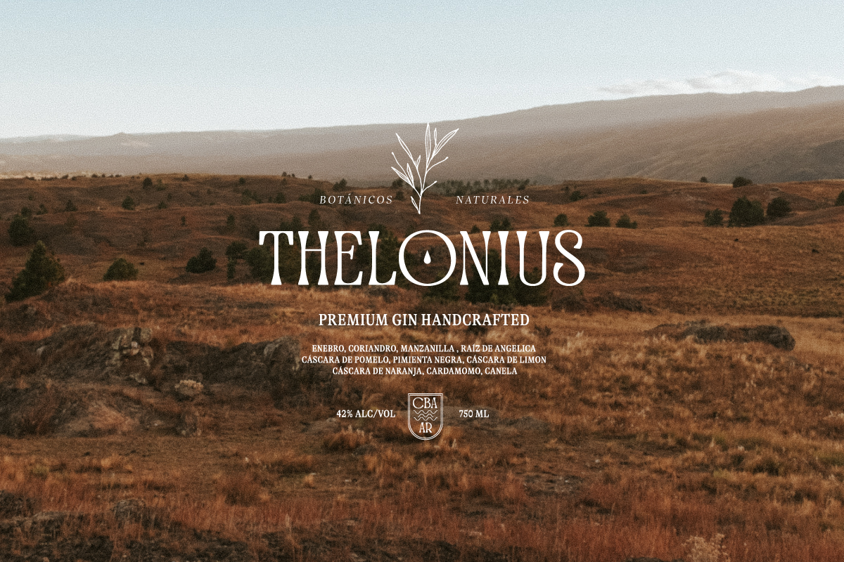
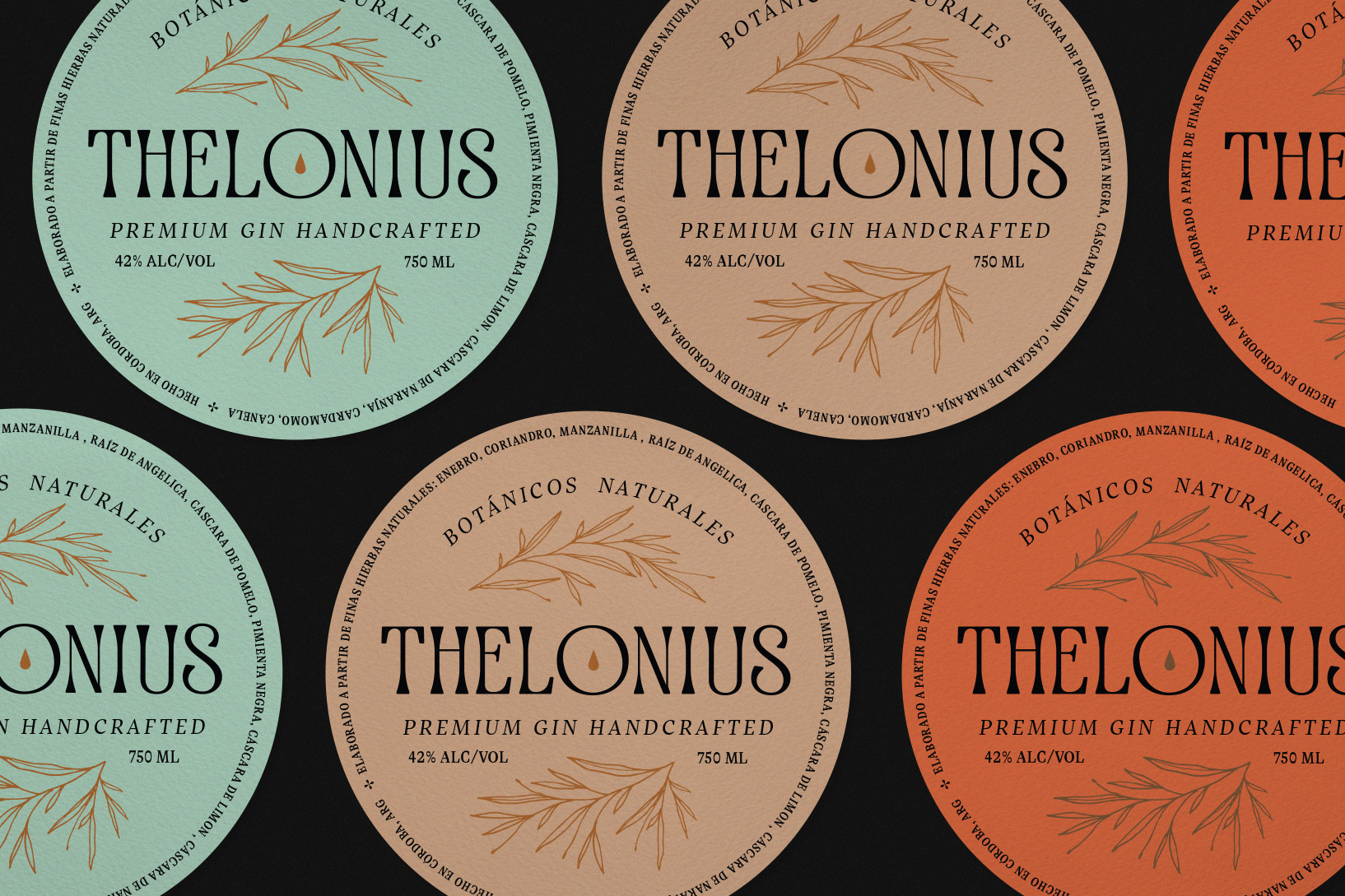
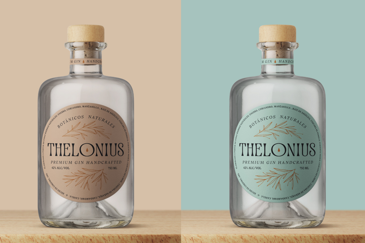
Thelonius
︎ Identity & Packaging
Gin Thelonius, is an Argentine gin brand hailing from Cordoba, artfully captures the essence of the Serrana region through its locally sourced botanicals. Collaborating with the NMAM agency, I embarked on a journey to conceptualize the brand and craft label designs that would evoke an essence of refined herbal character. The result was a visual identity that intrigues and enchants gin enthusiasts, leaving an indelible mark of sophistication and allure.
The design initially debuted as labels, employing specialty inks and letterpress stamps. Subsequently, it was unveiled in a limited edition, featuring ceramic bottles with cork and wood stoppers.


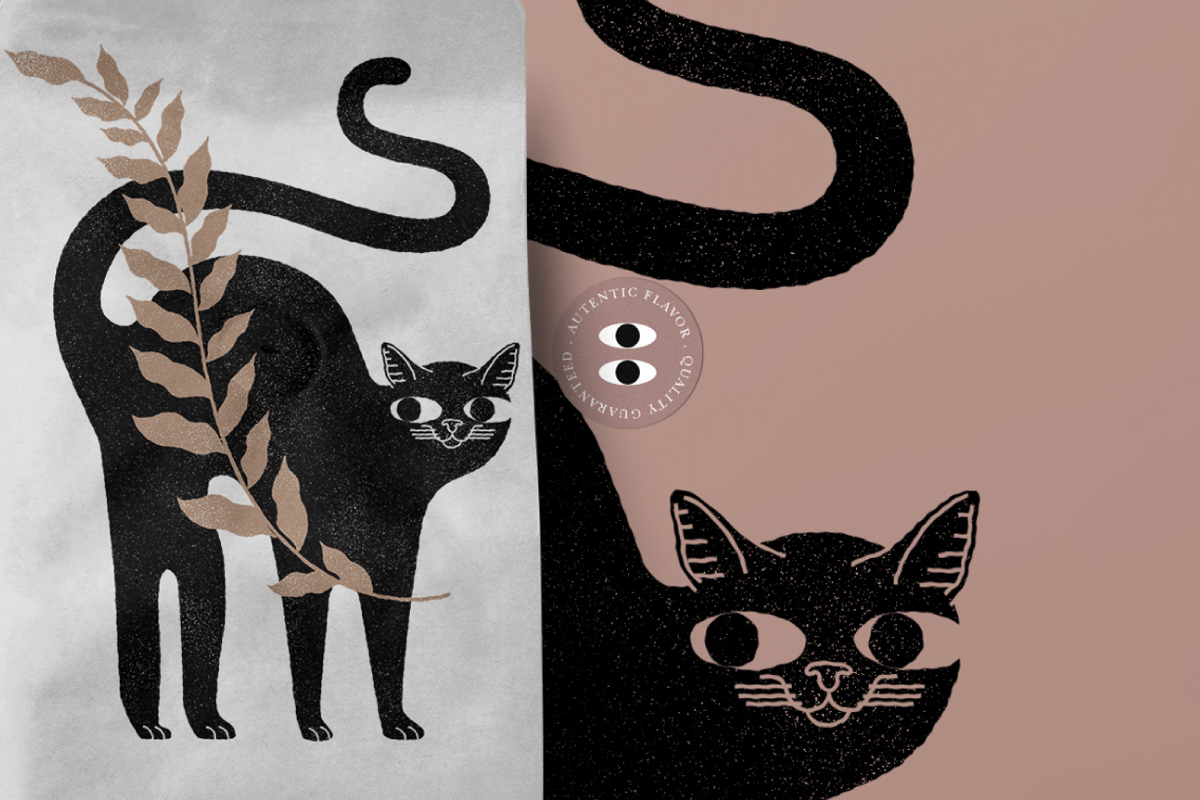
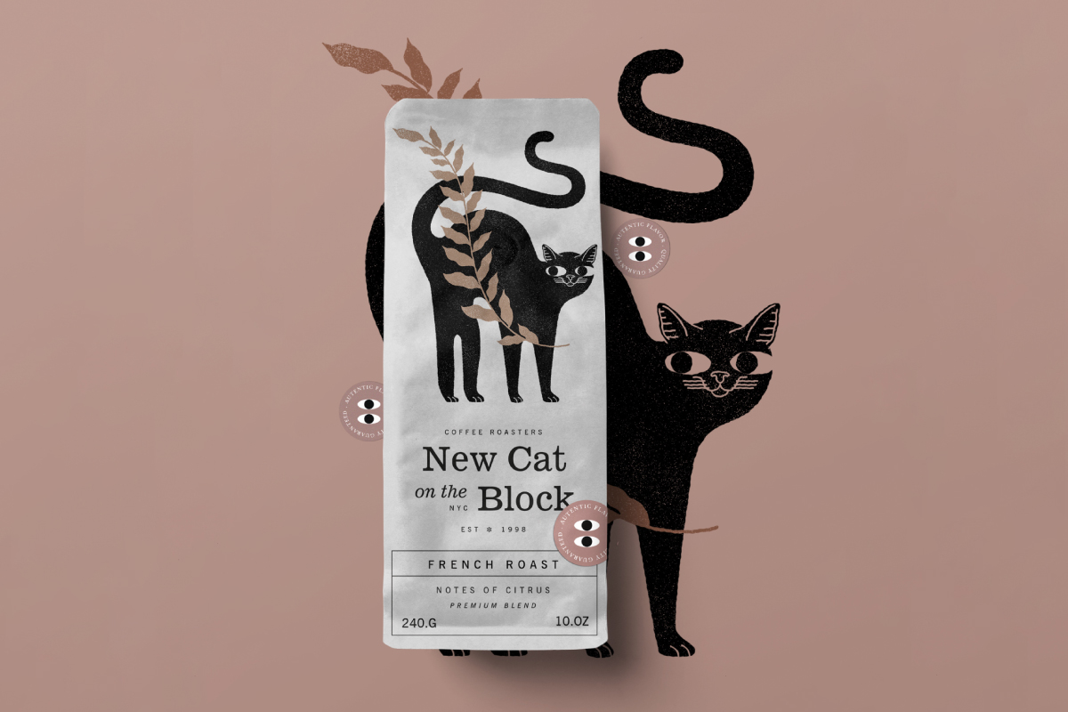
NCB Coffee
︎ Identity & Packaging
"New Cat on the Block" is a project for a limited edition conceptual coffee brand, for which I have developed the naming, identity, illustration, and packaging design. The objective was to create a playful, creative brand that captured young consumers' attention. Unfortunately, the brand didn't reach the market, as the project remained in the ideation phase and was ultimately discontinued.
Dirt & Bones
︎ Identity, Social Media
"Dirt & Bones" is a Boulder, Colorado-based brand that aims to provide transformative experiences to the community through herbal remedies and healing gatherings centered around plant-based solutions, fostering mental and physical clarity.
The name "Dirt & Bones" embodies the concept of the cyclical nature of life, where everything ultimately returns to the earth.
The concepts were Eclecticism, Naturalism, Relaxation, and Freshness. They were translated into an array of packaging, labels, merchandise, and even social media template designs.


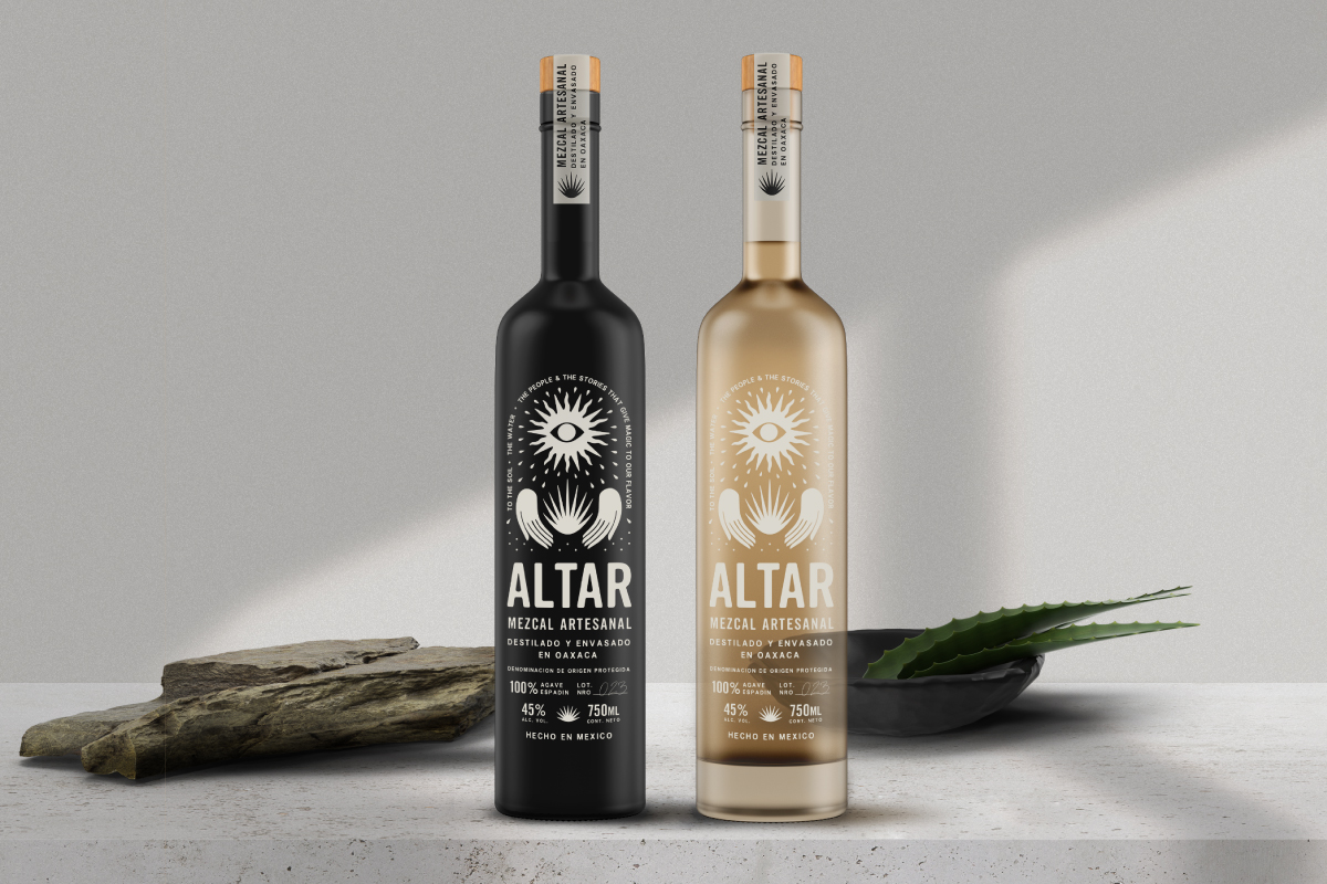
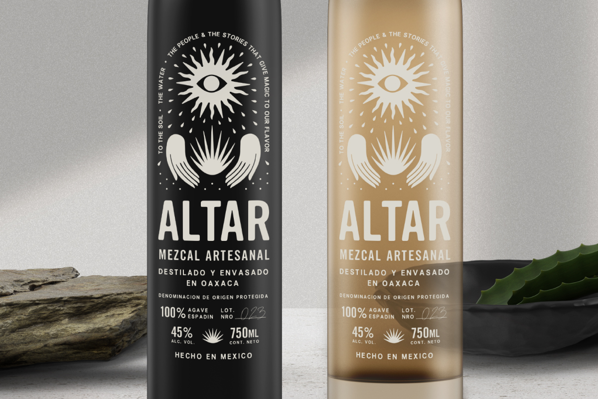
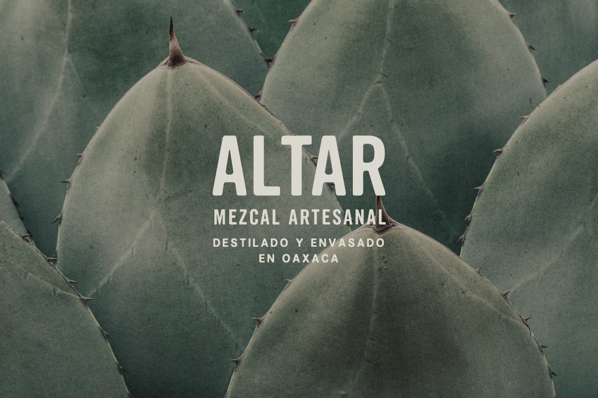
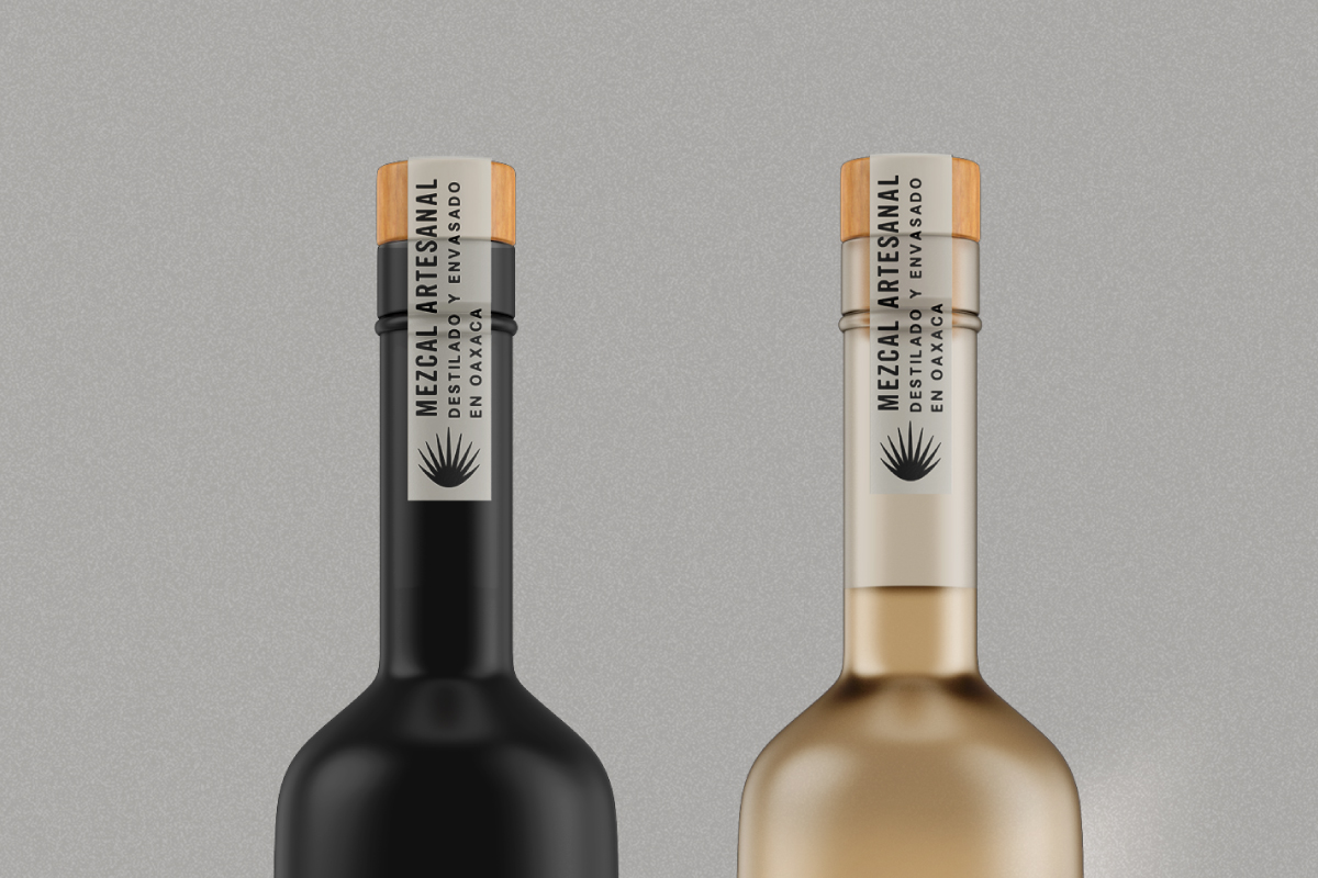
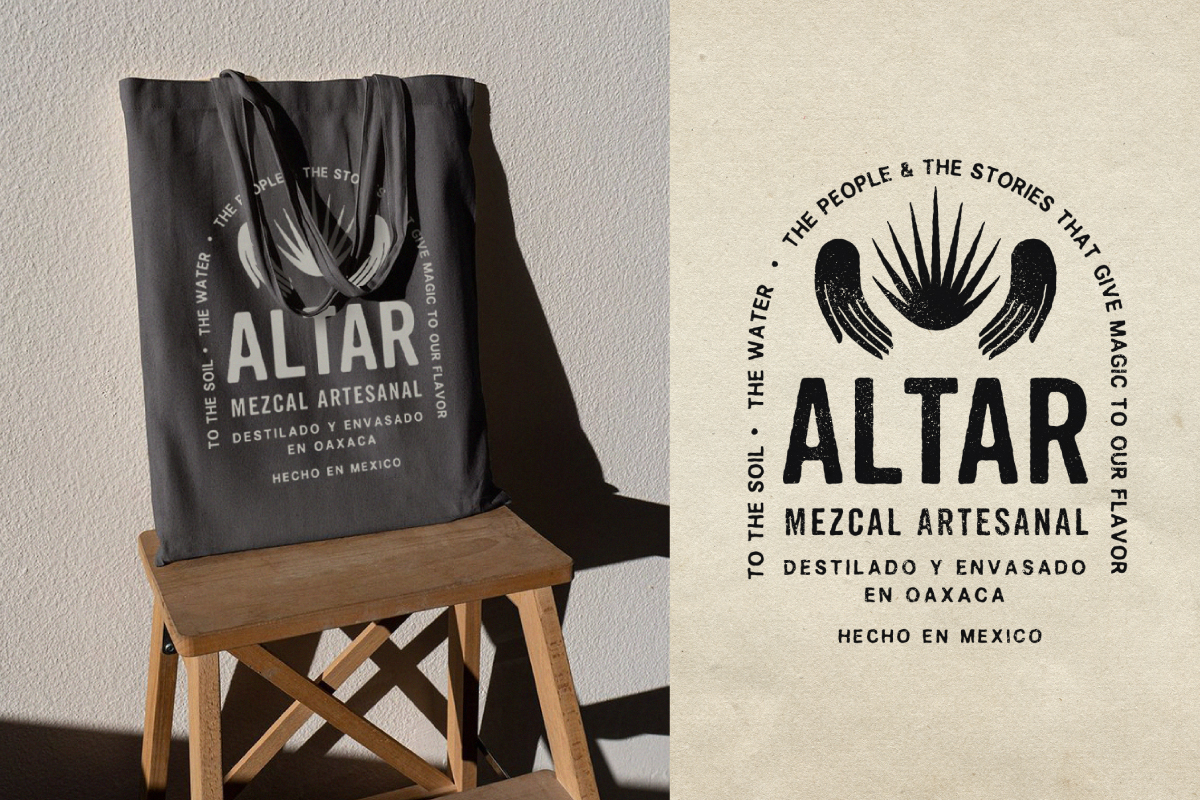
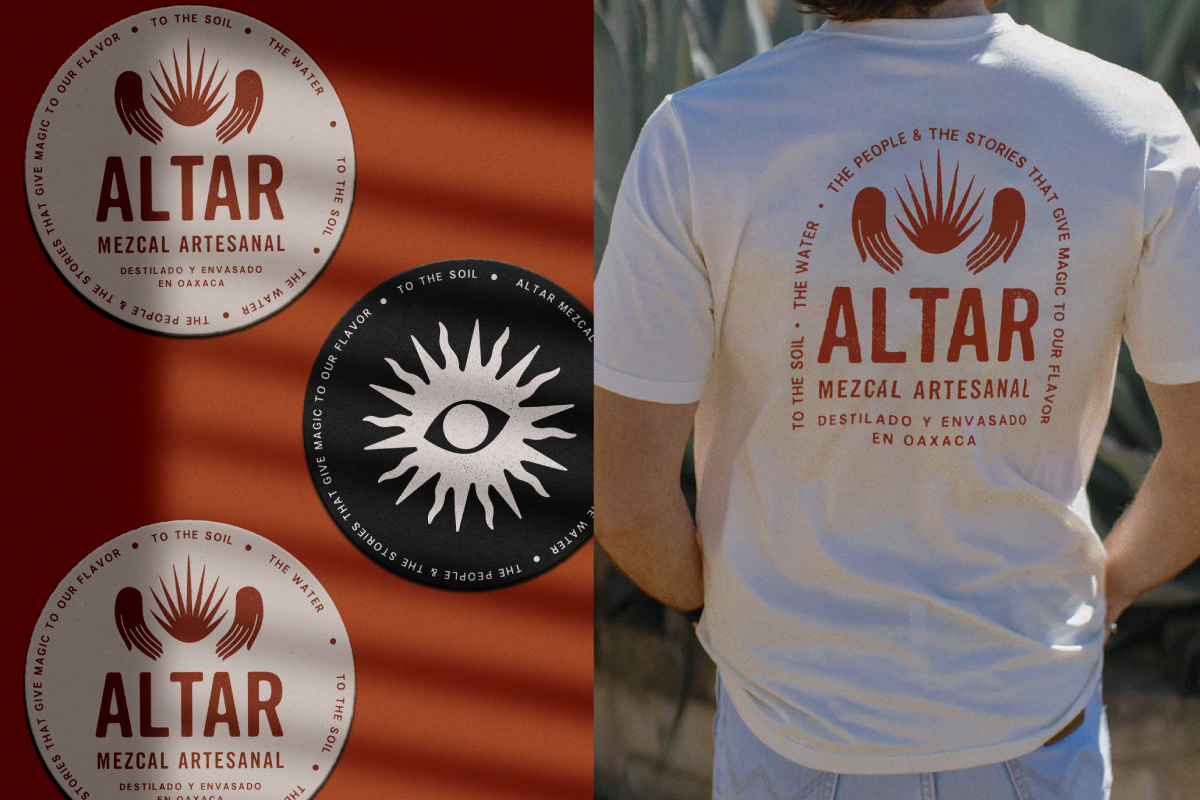
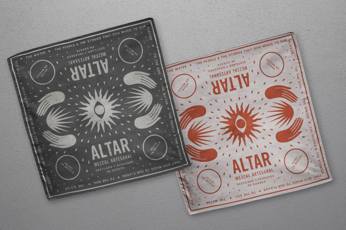
Altar (Mezcal)
︎ Identity & Packaging
Born from the heart of an Oaxacan family enterprise, Altar Mezcal is more than just a mezcal; it's a profound familial connection, a tribute to the roots. It's where heritage seamlessly integrates with the contemporary, inviting every sip to become a deliberate step into tradition.
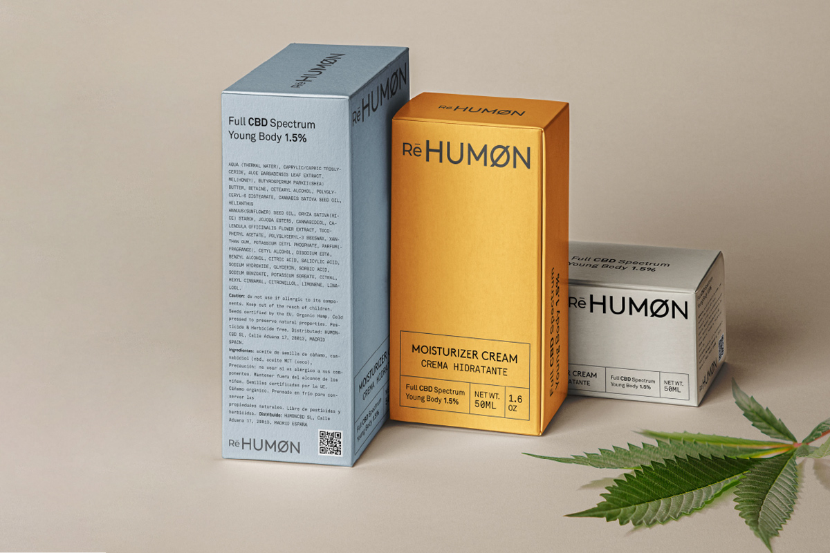
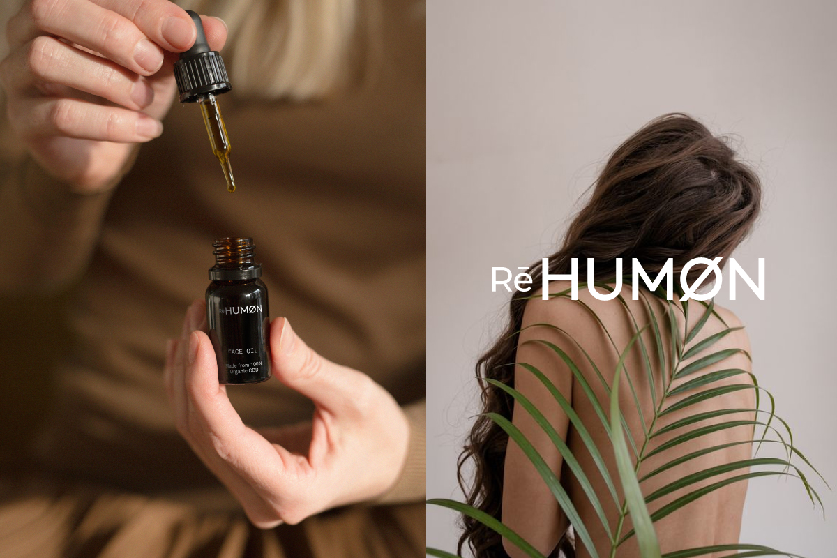
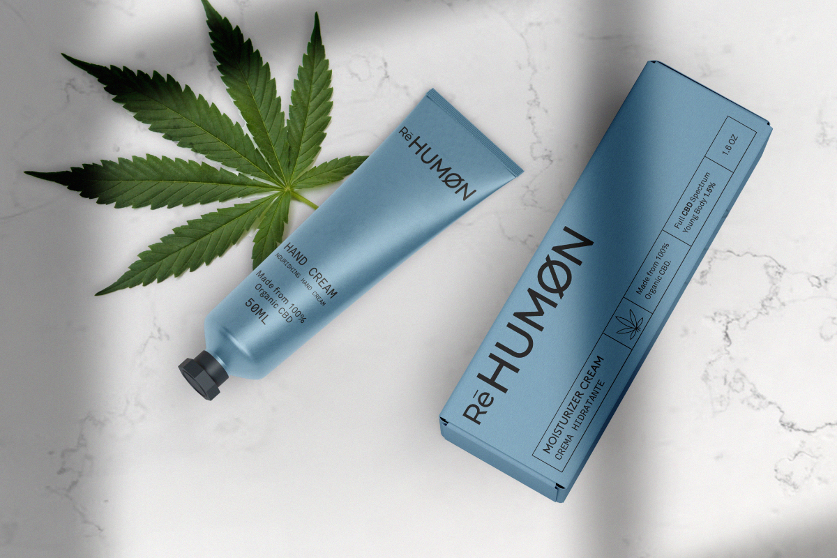
Humon
︎ Identity & Packaging
Re HUMON is a fresh CBD product brand, embodying the fusion of clean, minimal design with the potency of CBD-infused cosmetics. This project involved a rebranding to infuse sophistication into daily skincare rituals, presenting a harmonious synergy of nature and science.
︎ Identity & Packaging
Re HUMON is a fresh CBD product brand, embodying the fusion of clean, minimal design with the potency of CBD-infused cosmetics. This project involved a rebranding to infuse sophistication into daily skincare rituals, presenting a harmonious synergy of nature and science.
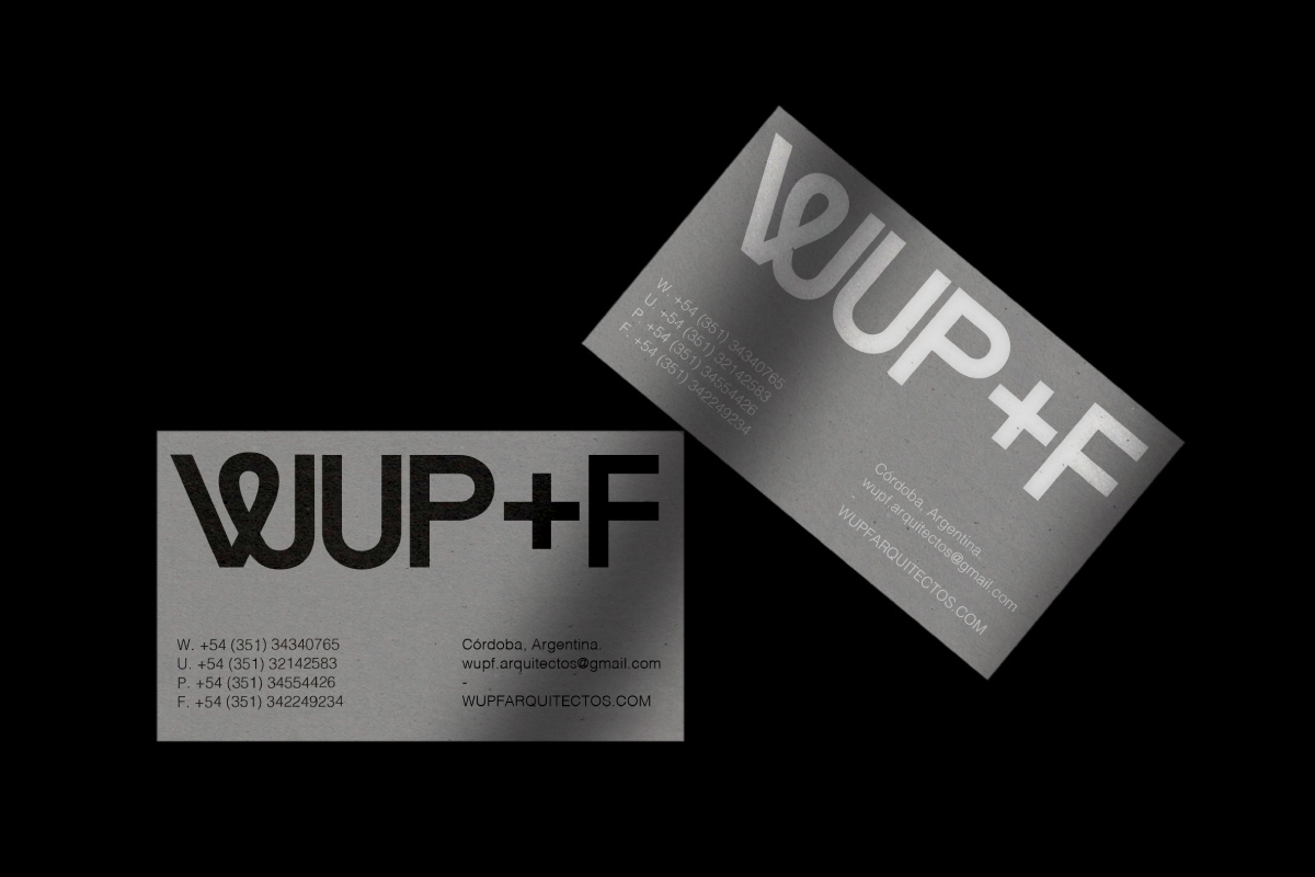
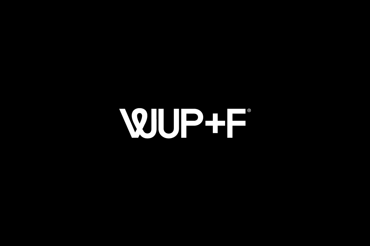
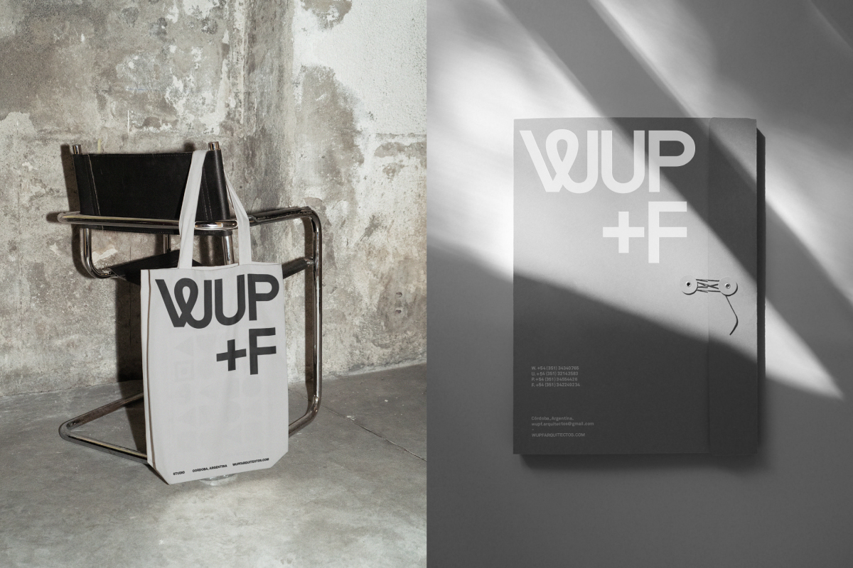
WUPF
︎ Identity
WUPF is an architecture studio from Córdoba, Argentina, for which I took on the challenge of creating a minimalist and timeless identity and brand. My goal was to craft a visual representation based on neutral colors, where the texture and color of concrete take center stage, imparting a lasting and contemporary essence.
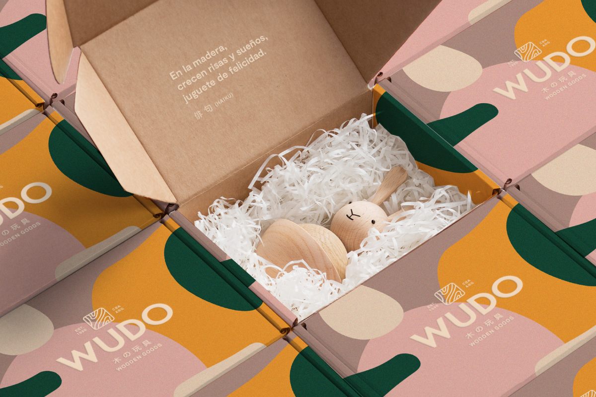
WUDO
︎ Identity
WUDO (Wooden Goods) is a small carpentry company located in Cordoba, Argentina, inspired by Japanese wooden toys made from noble woods. A toy that endures through time, like those of the past, yet modern. The branding was developed on a freelance basis in collaboration with the NMAM agency.


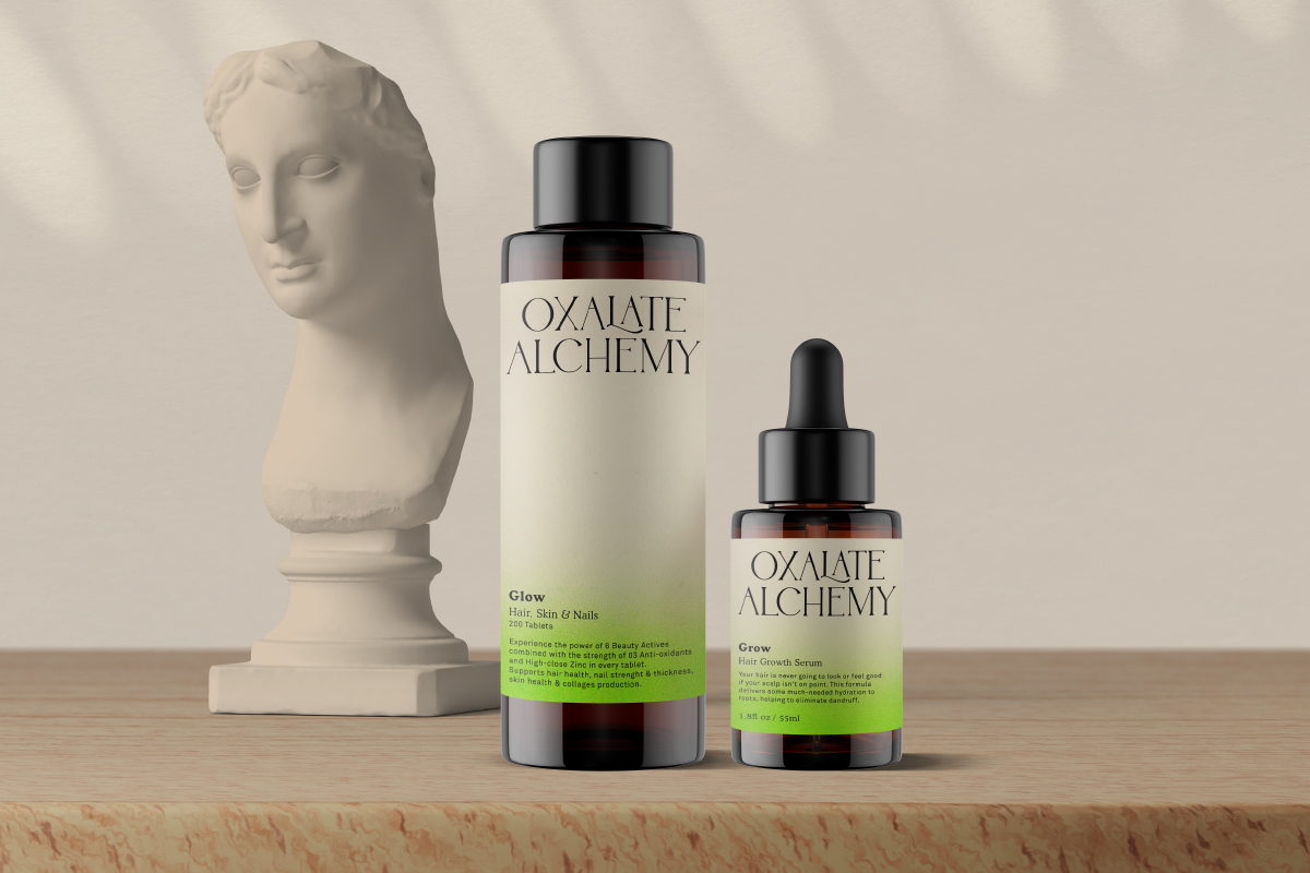
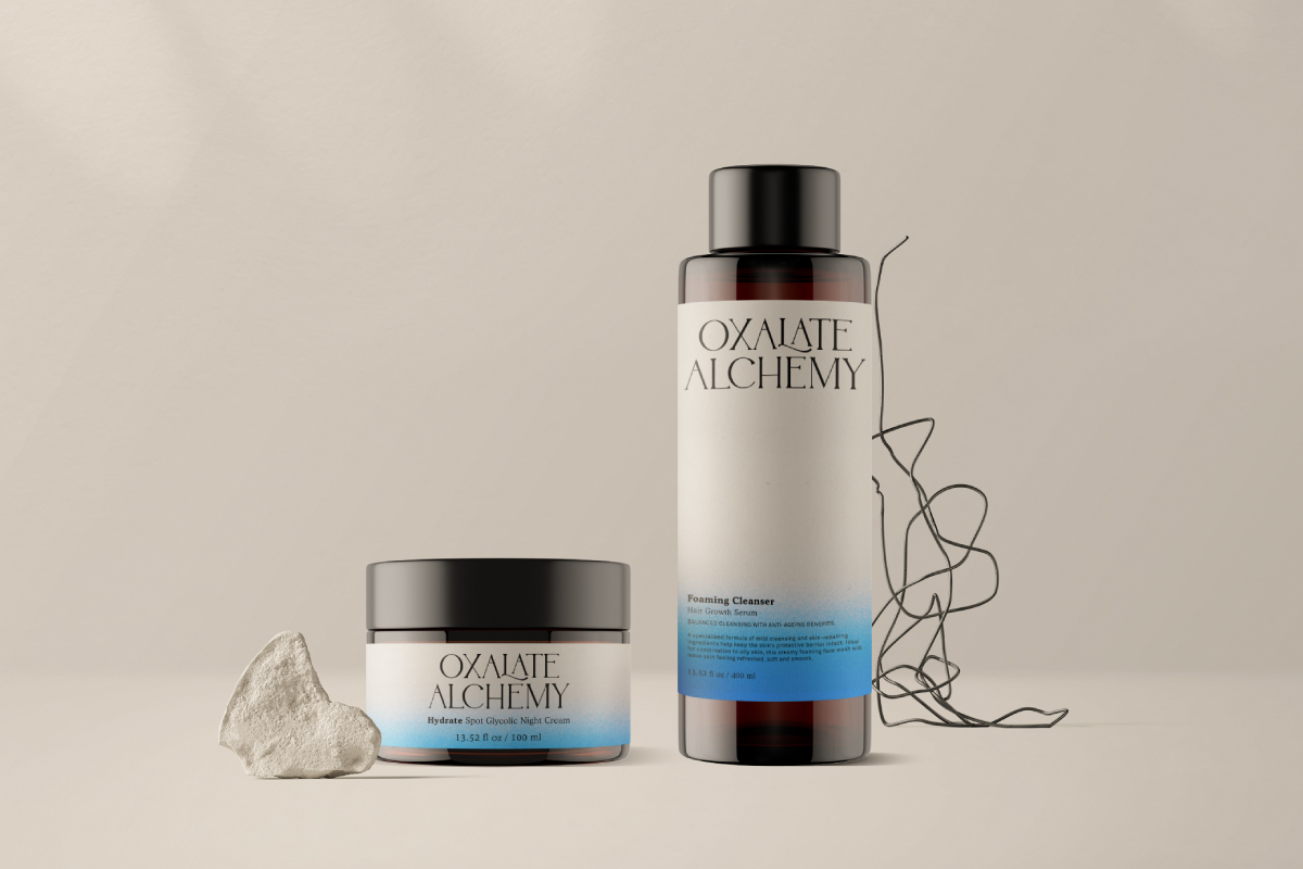
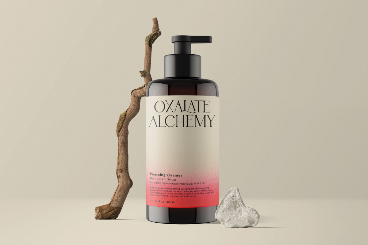
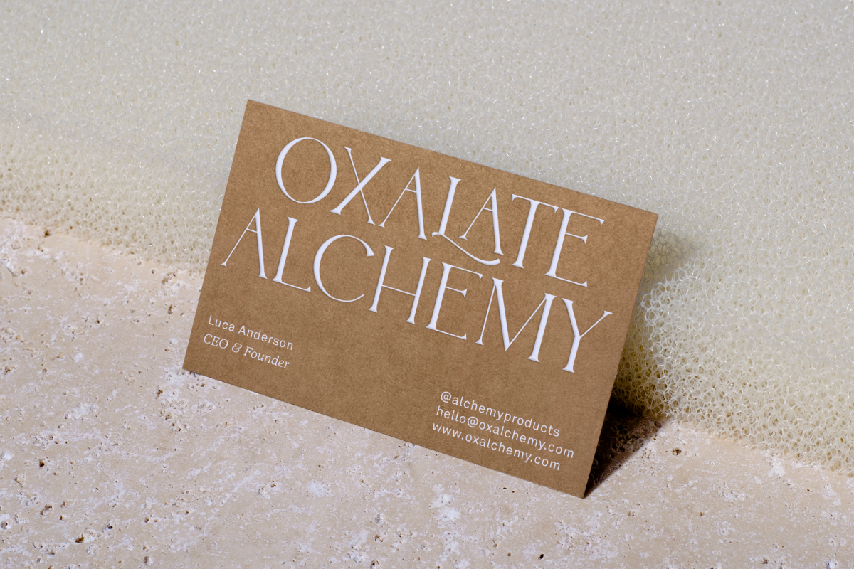
Oxalate Alchemy
︎ Identity & Packaging
OA is an Australian brand designed for health-conscious individuals of all ages, offering a seamless fusion of science and nature.
The brand is devoted to creating pharmaceuticals and cosmetics, all harnessed from the power of oxalate—a compound renowned for its extraordinary properties.
The brand was conceived to be clean and minimalistic in aesthetic, with the proposition of evoking a sense of medical precision while also conveying a youthful essence through graphic elements with hints of color.


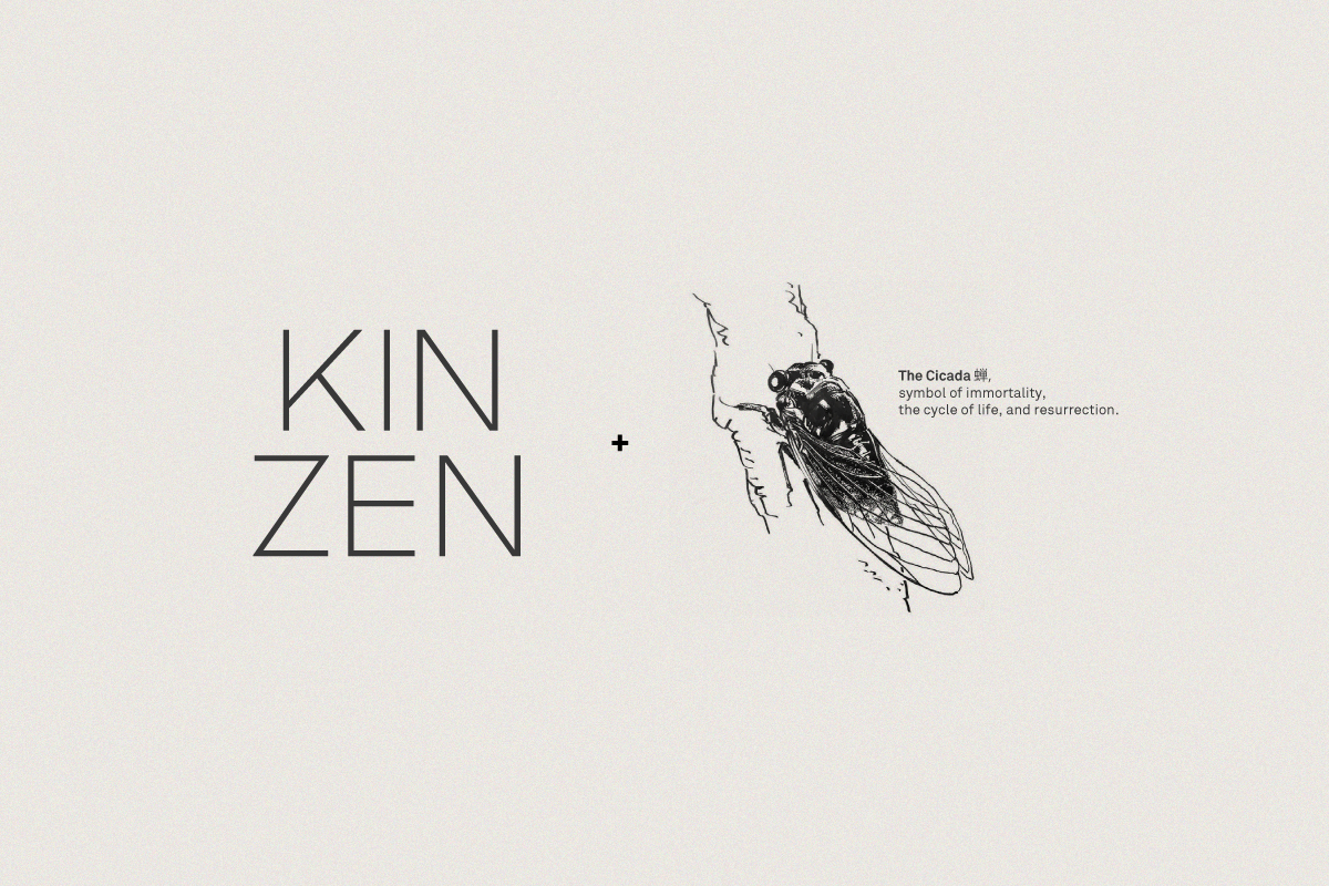
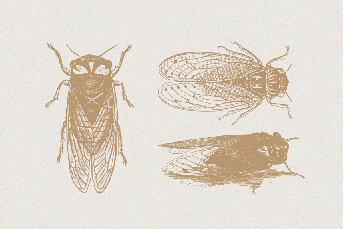
Kinzen (Tea Omakase)
︎ Identity
Kinzen is an expedition through an ancient artisan village, a journey that intertwines with nature and the changing seasons. It's a stroll through lush green spaces, woodworking workshops, accompanied by the sounds of water and fire.
In Kinzen, life unfolds in real time, celebrating the refinement of craftsmanship and aesthetics. It's a rekindling of indigenous values and a harmonious fusion of diverse cultures.
Kinzen is an experience with tea, embodying a simple concept where the stars are tea and nature.


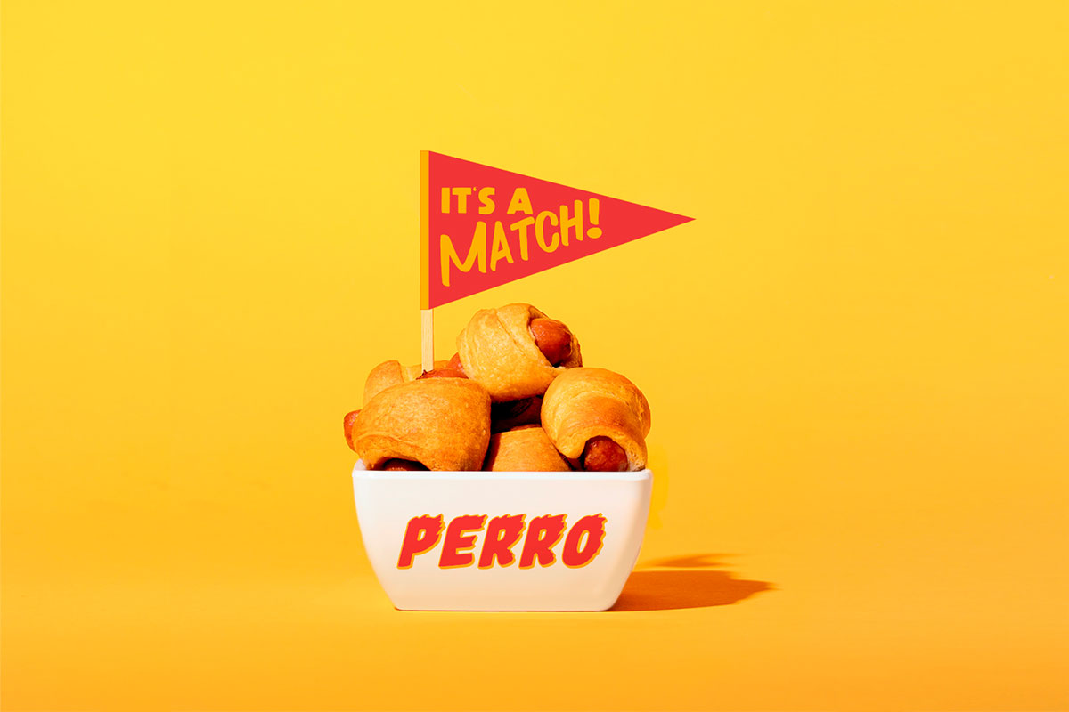
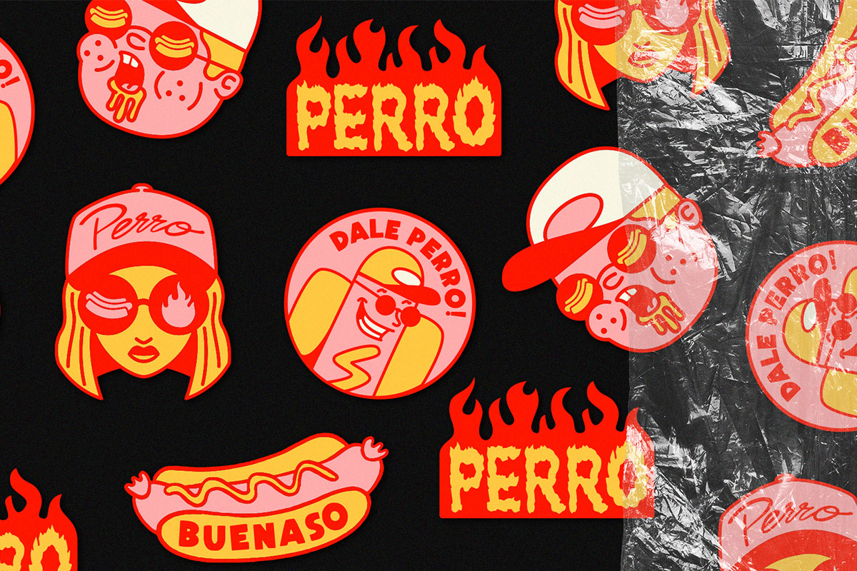
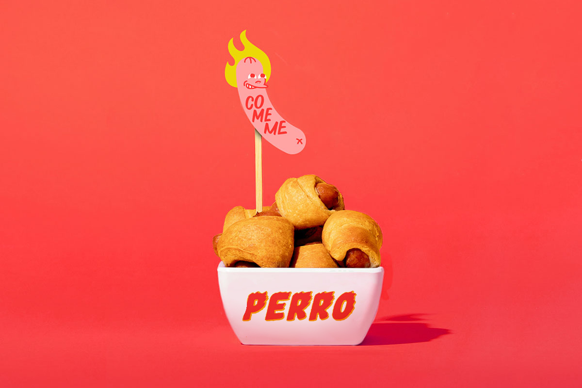
Perro
︎ Identity & Packaging
"Perro" is a project that we collaborated on with Ariel Monjes, an Argentine illustrator and designer. This project was undertaken for a hotdog shop located in the city of Cordoba. We embarked on creating the branding, illustrations, and various graphic assets. The overarching concept was to infuse a cool and youthful vibe, catering to an adolescent audience. We employed stickers, vibrant pop colors, and alluring illustrations to bring this concept to life.

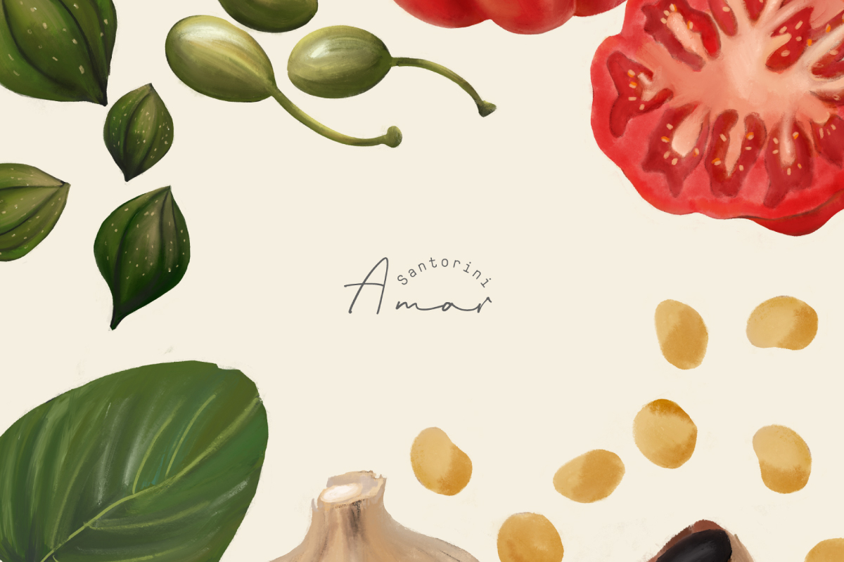
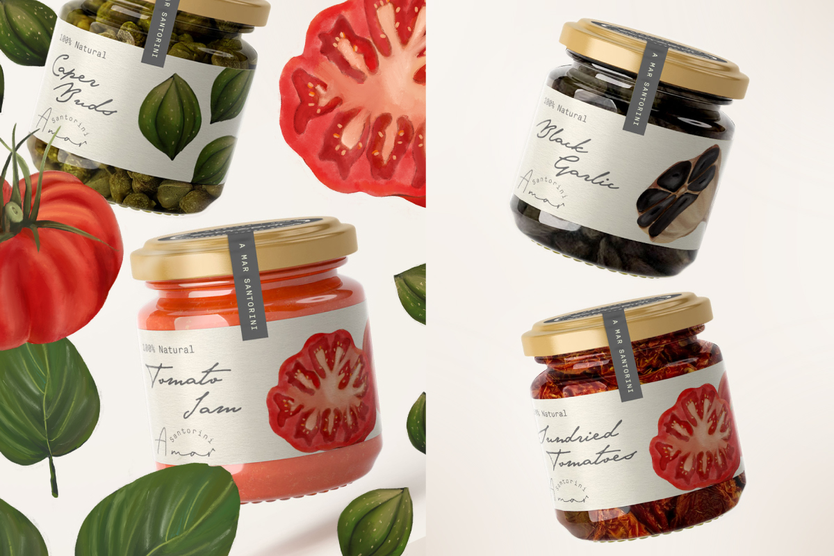
Amar Santorini
︎ Identity & Packaging
Amar Santorini is a project I've collaborated on with the spanish studio Eva Hilla. It involves homemade natural products that are also typical of this famous Greek island.
"A Mar" calls to the sea and to love. These are natural products, without preservatives. Tomatoes, capers, leaves, and garlic, all illustrated by hand to reflect the island's charm.


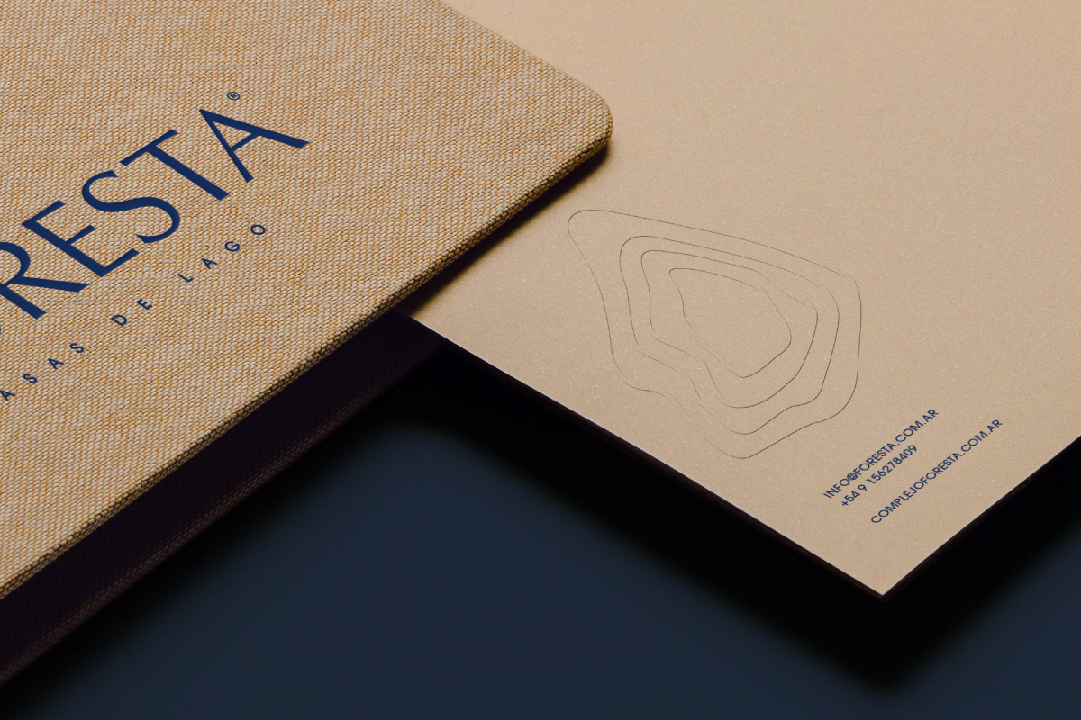
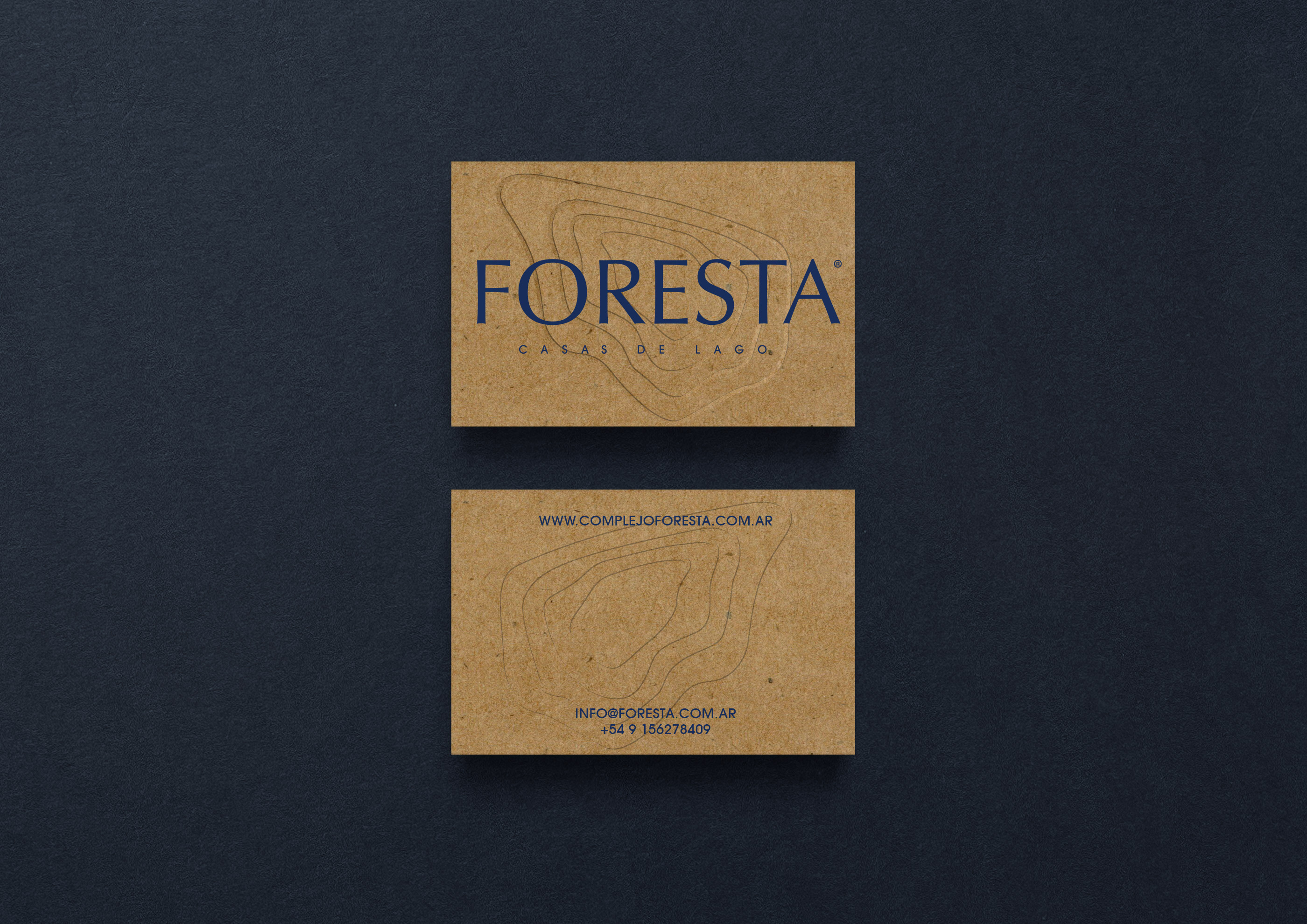
Foresta
︎ Identity & Merchadising
Foresta, Casa de Lagos, is a collaborative project we developed with NMAM Agency. It encompasses a housing development currently under construction, offering stunning lake views in the Cordobesan hills (Argentina). We've designed a range of welcome merchandise for the clients and communication materials to enhance their experience